Best Bootstrap Alternatives in 2026: 8 CSS Frameworks Compared

- 1
 Tailwind CSSUtility first styling with full controlVisit
- 2
 FoundationResponsive sites with ready componentsVisit
- 3
 BulmaSimple CSS only componentsVisit
- 4
 MaterializeMaterial design componentsVisit
- 5
 Semantic UIReadable class names and componentsVisit
- Tailwind CSS is the most popular utility first alternative.
- Bulma and Foundation suit developers who want ready components without JavaScript.
- Chakra UI and Ant Design suit React projects with large component needs.
- Check how much custom design you want before choosing a component heavy framework.
Quick comparison
| Product | Ideal for | Price from | Free version | |
|---|---|---|---|---|
| Tailwind CSS | Utility first styling with full control | Free | Yes | Visit |
| Foundation | Responsive sites with ready components | Free | Yes | Visit |
| Bulma | Simple CSS only components | Free | Yes | Visit |
| Materialize | Material design components | Free | Yes | Visit |
| Semantic UI | Readable class names and components | Free | Yes | Visit |
 UIkit | Lightweight components and a grid | Free | Yes | Visit |
 Ant Design | Large React apps with many components | Free | Yes | Visit |
 Chakra UI | Accessible React components | Free | Yes | Visit |
The best Bootstrap alternatives
Bootstrap gives you ready components and a grid. The alternatives below take different routes: utility first styling, ready component libraries, or lighter frameworks. The right pick depends on how much control you want over design.
Tailwind CSS
Ideal for: Utility first styling with full control
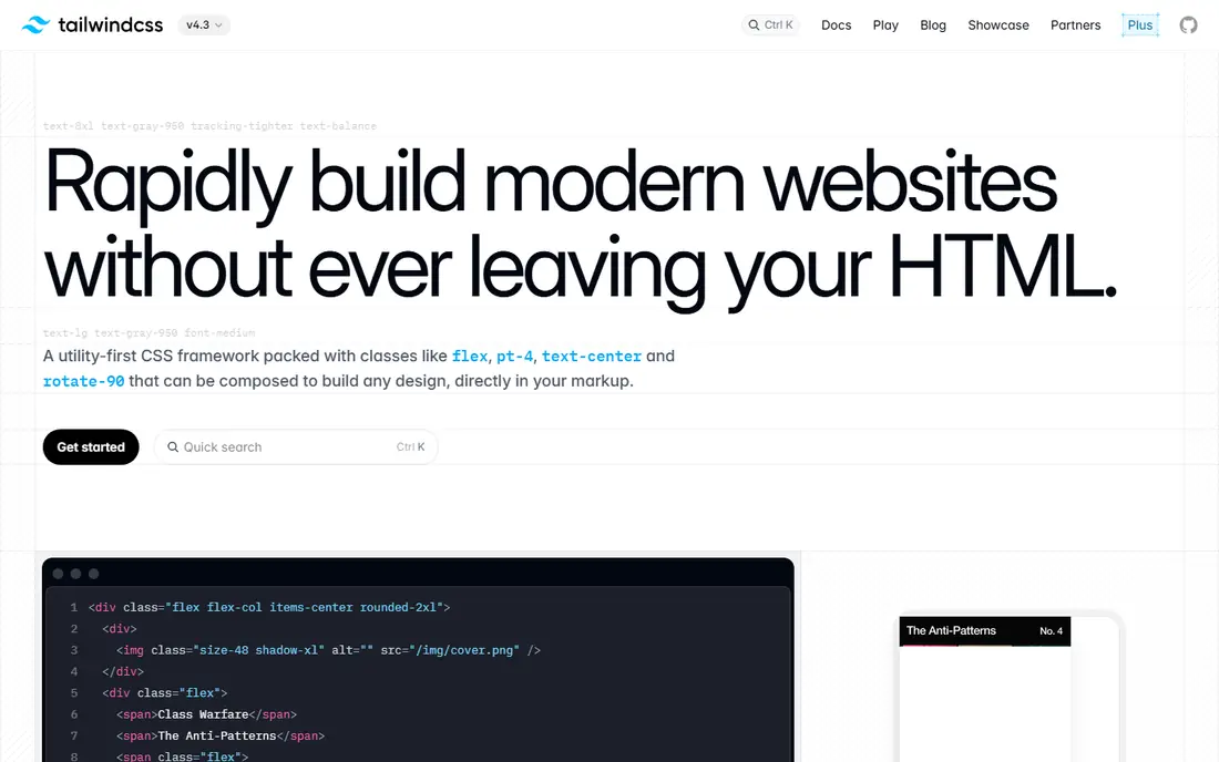
Tailwind CSS is a practical option for utility first styling with full control. Tailwind CSS is a utility first framework that lets you style elements with small classes rather than prebuilt components. On its official feature and pricing pages, the strengths that stand out most are utility classes for fast styling and highly customisable. We compared its official pages with the other tools here.
For day to day use, Tailwind CSS suits people who want utility first styling with full control without a long setup process. Tailwind CSS is a utility first framework that lets you style elements with small classes rather than prebuilt components. Try the free option or trial first if one is offered, and check current plan details on the official site.
The honest catch is html can get class heavy. Your markup can become class heavy, and you need a build step, but the control over design is excellent. If that trade-off matters, compare the next option on price and setup effort.
- Utility classes for fast styling
- Highly customisable
- Large community and docs
- HTML can get class heavy
- Setup needs a build step
Foundation
Ideal for: Responsive sites with ready components
For responsive sites with ready components, Foundation deserves a close look. Foundation is a responsive front end framework with a grid, components and accessibility features. Its official pages point to responsive grid and components as a core strength. We checked its feature pages, pricing and app store listing against the other options here.
What makes Foundation useful in practice is the way it handles the main job without adding extra steps. Foundation is a responsive front end framework with a grid, components and accessibility features. Try the free plan or trial first on a real task from your own routine before you commit.
No tool is free of trade-offs, and here the main one is community is smaller than tailwind or bootstrap. The community is smaller than it once was, so check that the version you use is actively maintained. Weigh that against price and the features you need most.
- Responsive grid and components
- Good accessibility focus
- Flexible and customisable
- Community is smaller than Tailwind or Bootstrap
- Updates are slower
Bulma
Ideal for: Simple CSS only components
Bulma takes a different approach to simple css only components, and that is why it is on this list. Bulma is a CSS only framework with clean classes and ready components that need no JavaScript. The official feature page highlights css only, no javascript needed.
In use, Bulma is best judged on one question: does it handle your main task with less effort than the tool you use now? Bulma is a CSS only framework with clean classes and ready components that need no JavaScript. If the answer is yes, the price is easier to justify. If not, compare the next product side by side.
The catch to note is javascript components need your own code. You will need your own JavaScript for interactive parts, but the styling itself is simple to use. Read the pricing page carefully and confirm the plan covers the features you will rely on.
- CSS only, no JavaScript needed
- Clean, readable classes
- Easy to learn
- JavaScript components need your own code
- Fewer components than Bootstrap
Materialize
Ideal for: Material design components
If your priority is material design components, Materialize is worth shortlisting. Materialize is a framework based on Google Material design, with ready components and a distinct look. We compared its official pages with the other products here, and material design look out of the box came through as its clearest advantage.
Day to day, Materialize is straightforward to pick up. Materialize is a framework based on Google Material design, with ready components and a distinct look. Use any free plan or trial to run a real task through it, since that tells you more than a feature list.
Be aware of one limit: project updates are infrequent. Updates have been infrequent, so check the current release before starting a long project. Check the official pricing page before you pay.
- Material design look out of the box
- Ready components
- Easy to start
- Project updates are infrequent
- Custom design takes extra work
Semantic UI
Ideal for: Readable class names and components
Semantic UI is a practical option for readable class names and components. Semantic UI is a component framework with readable class names and a large set of ready parts. On its official feature and pricing pages, the strengths that stand out most are human readable class names and large component set. We compared its official pages with the other tools here.
For day to day use, Semantic UI suits people who want readable class names and components without a long setup process. Semantic UI is a component framework with readable class names and a large set of ready parts. Try the free option or trial first if one is offered, and check current plan details on the official site.
The honest catch is development has slowed. Development has slowed, so it suits existing projects more than brand new long term builds. If that trade-off matters, compare the next option on price and setup effort.
- Human readable class names
- Large component set
- Good theming
- Development has slowed
- Setup can be heavy
UIkit
Ideal for: Lightweight components and a grid
For lightweight components and a grid, UIkit deserves a close look. UIkit is a lightweight, modular framework with a grid and a solid set of components. Its official pages point to lightweight and modular as a core strength. We checked its feature pages, pricing and app store listing against the other options here.
What makes UIkit useful in practice is the way it handles the main job without adding extra steps. UIkit is a lightweight, modular framework with a grid and a solid set of components. Try the free plan or trial first on a real task from your own routine before you commit.
No tool is free of trade-offs, and here the main one is smaller community than larger rivals. The community is smaller, so third party themes and help are less plentiful. Weigh that against price and the features you need most.
- Lightweight and modular
- Good grid and components
- Clean docs
- Smaller community than larger rivals
- Fewer third party themes
Ant Design
Ideal for: Large React apps with many components
Ant Design takes a different approach to large react apps with many components, and that is why it is on this list. Ant Design is a React UI library with a very large set of enterprise ready components. The official feature page highlights very large react component set.
In use, Ant Design is best judged on one question: does it handle your main task with less effort than the tool you use now? Ant Design is a React UI library with a very large set of enterprise ready components. If the answer is yes, the price is easier to justify. If not, compare the next product side by side.
The catch to note is bundle size can grow. The design language is opinionated, so heavy custom styling takes extra work. Read the pricing page carefully and confirm the plan covers the features you will rely on.
- Very large React component set
- Good docs
- Enterprise friendly
- Bundle size can grow
- Design language is opinionated
Chakra UI
Ideal for: Accessible React components
If your priority is accessible react components, Chakra UI is worth shortlisting. Chakra UI is a React component library focused on accessibility, theming and a simple API. We compared its official pages with the other products here, and accessible components by default came through as its clearest advantage.
Day to day, Chakra UI is straightforward to pick up. Chakra UI is a React component library focused on accessibility, theming and a simple API. Use any free plan or trial to run a real task through it, since that tells you more than a feature list.
Be aware of one limit: react only. It is React only, so it is not a pick for plain HTML or other frameworks. Check the official pricing page before you pay.
- Accessible components by default
- Good theming
- Simple React API
- React only
- Some advanced components need extra work
How we picked these
We compared official feature pages, pricing pages, app store listings, privacy policies and public reviews for each product in this list. We kept only products that exist and work in October 2026 and that fit the topic directly, and we left out products that only partly matched. Where a price could not be verified from the vendor site or app store listing, we wrote See website rather than guessing.
How to choose a CSS framework
First decide between utility classes and ready components. Utility frameworks give more design freedom but need more styling decisions. Component frameworks are faster to start but harder to restyle deeply. Your team skill and project length should guide that choice.
Then check maintenance and bundle size. A framework with recent releases, clear docs and a manageable bundle will serve a long project better than a larger or stalled one. Build a small test page with each finalist before committing a full site to it.
Frequently asked questions
What is the best option for bootstrap alternatives?
There is no single winner for every reader, because the right pick depends on budget, team size and the features you will use daily. Start with the best_for note in the comparison table, then test the free plan or trial on a real task. That short test usually shows which tool fits your routine best.
Are there free options for bootstrap alternatives?
Yes, several products in this list offer a free plan or a free trial, and the table shows which ones do. Free plans usually limit volume, seats or advanced features, so check those limits before you rely on one. A paid plan is often worth it once the free limits start to slow you down.
How do I switch from my current tool for bootstrap alternatives?
Export your data first, then set up the new tool alongside the old one for a short overlap period. Move one project or workflow at a time and check that the important data carried over correctly. Cancel the old plan only after the new setup has handled a full week of normal work.
Which option is best for a small team or a single user?
A single user or small team should favour a tool with a clear free or low cost plan and a short learning curve. Larger teams should weigh admin controls, permissions and support more heavily. The product notes in this list call out which audience each tool suits best.
Do I need to pay straight away for bootstrap alternatives?
No, most tools here let you start free or on a trial, and you should use that period well. Test the features you will use most, not just the headline features on the marketing page. Pay only when the tool has already proved useful on real work.