If you need associative exploration with data integration, Qlik Sense is the first tool to look at here. Listed starting prices: Tableau from $15 per user per month. Sisense fits embedded analytics in products; Domo fits connected data journey and insights. The other 2 tools in the list cover narrower or pricier cases.
If you are comparing BI data visualization tools, this page covers 5 tools in one place: what each is best for, what it costs to start, whether it has a free plan, and the main limit to know about.
Key takeaways
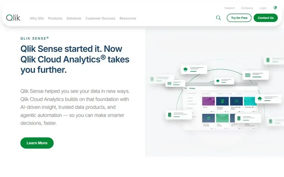
Number one here is Qlik Sense, a fit for associative exploration with data integration.
A fair warning about Qlik Sense: breadth of suite brings complexity.
Tableau is the only tool of the 5 with a free plan.
Starting prices begin at $15 per user per month with Tableau.
Tableau is the one to check for visual analysis and dashboard sharing.
Best for: Associative exploration with data integration
Pick Qlik Sense if this describes you: associative exploration with data integration. Organizations that only need straightforward dashboards may find a lighter visualization tool simpler to adopt, whereas those needing embedded product analytics should compare dedicated choices.
Since the offering spans integration, quality and analytics, planning and administration can be involved. Beyond that, the product is pitched at organizations that want to link and prepare data and then explore it for insights. No starting price is listed for Qlik Sense here; confirm pricing on the vendor site. Trial and free access: Not stated.
Drawbacks to consider: Governance setup takes effort.
Think of Sisense for embedded analytics in products. Sisense provides AI-powered embedded analytics with pro-code, low-code and no-code adaptability, positioning it for businesses that want to turn data into revenue inside their own products.
Watch-outs: Embedded focus may not suit all BI.
In practice, organizations prioritizing wide self-service visual exploration for internal staff should weigh general BI platforms alongside it. An embedded-first system may be more than a purely internal reporting team needs, and deeper customization can need developer resources. This comparison lists no price for Sisense; ask the vendor. Free plan details: Free trial.
Domo works best for connected data journey and insights. Domo presents AI and data products spanning the data journey: connecting and moving data from sources, preparing and expanding access for exploration, and accelerating business-critical insights.
From a buyer's view, if your need is narrow, for example embedded dashboards only, a focused tool may be more straightforward to operate and explain to stakeholders. Domo shows no starting price here, so confirm the cost on the vendor site. Free access: Free trial.
Drawbacks to consider: Feature breadth can complicate rollout.
For reports and dashboards with AI insights, IBM Cognos Analytics is a natural candidate. IBM Cognos Analytics helps users explore data, build reports and create dashboards, with AI-driven insights intended to surface trends and support informed decisions.
In daily use, as an enterprise product, setup and administration can be involved, and newer users may need time to learn the interface. For everyday use, smaller teams wanting rapid, self-service visual exploration may find a more focused visualization tool quicker to adopt. Pricing for IBM Cognos Analytics is not stated here, so ask the vendor for current figures. Free plan details: Not stated.
Where it falls short: Enterprise setup can be involved.
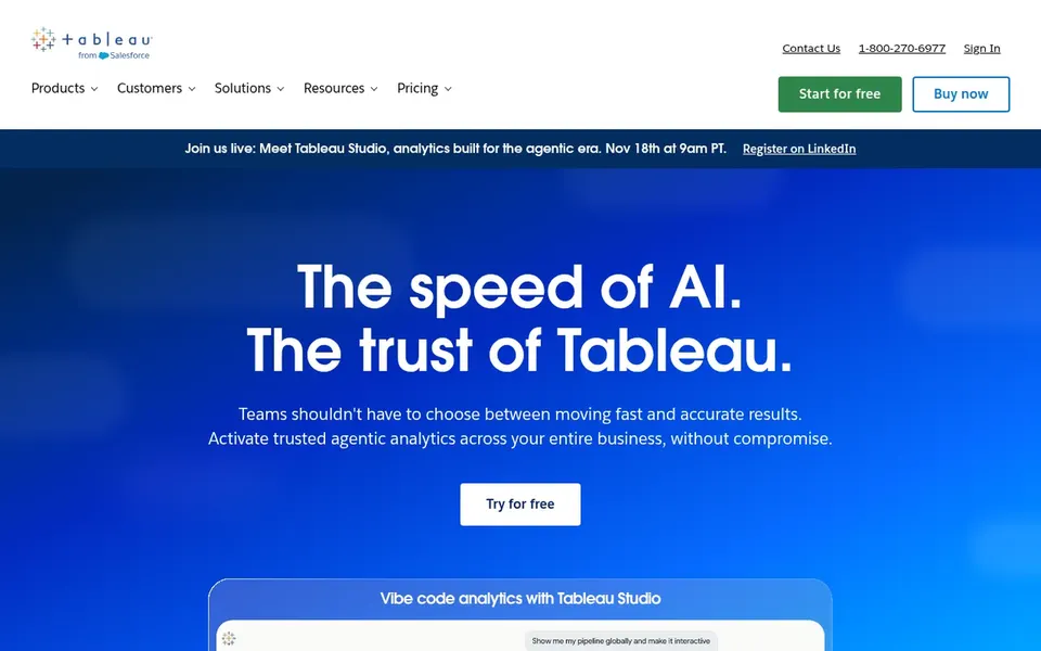
Tableau is designed for visual analysis and dashboard sharing. The depth that makes Tableau adaptable can slow newcomers, and consistent metrics need deliberate governance.
From a buyer's view, teams that primarily need embedded analytics inside a product, or a tightly governed semantic layer first, may prefer a system designed around those priorities. Price to start with Tableau: $15 per user per month. Tableau offers a free plan.
Drawbacks to consider: Rich features can overwhelm new users.
Ask Qlik Sense, Sisense, Domo and IBM Cognos Analytics for a written quote, since no starting price is shown.
Look at the free plan from Tableau closely: its caps decide whether it is usable for real work.
Run a trial of Sisense and Domo with real work before paying for a year; your own workflow is the best test.
Read the limits listed for Qlik Sense first: breadth of suite brings complexity.
Involve the people who will use IBM Cognos Analytics daily; a short pilot beats a long feature checklist.
Map your must-have features to a specific Domo plan before you compare prices.
How we picked
Pricing pages, product documentation and feature lists were the main sources, and every entry carries at least one honest drawback. Seat minimums, billing terms and add-ons can move the real cost, so the starting prices here are a guide and not a quote. The sequence is a judgement call: typical use case first, then pricing transparency, then free access. Use the profiles to check fit. That approach shaped the order of the 5 BI data Visualization tools tools listed here.
Every price and plan detail on this page comes from the vendors’ own websites. We did not run hands-on tests unless the text says so, and we do not publish star ratings or review scores. See how we score and our disclosure.
Keep your shortlist in one place
Paste prices, trial dates and notes from this guide into Ainotely, our AI note app. It files them into a topic and pulls out tasks like “cancel trial by Friday”. Free 7-day trial, no card needed.
How are the tools for BI data visualization tools ordered?
Qlik Sense sits first and Tableau last because the order follows typical fit for BI data visualization tools, then price clarity and free access. It is a judgement call, so read each profile for fit and limits.
Is Qlik Sense the right pick for everyone comparing BI data visualization tools?
No single tool suits every team. Qlik Sense comes first because it fits associative exploration with data integration, while Sisense suits embedded analytics in products and Domo suits connected data journey and insights. Match the tool to your own size, budget and workflow before deciding.
Can I try these options before paying?
Often, yes. Tableau has a free plan and Sisense and Domo offer a free trial. Use your own data and a real task during the test, and check what the free tier or trial limits before you rely on it. Each of the 5 options in this BI data Visualization tools guide has its own card above with the price, free plan and limits.
Which BI visualization tool is a good match for beginners?
Qlik Sense is the pick this page puts first, mainly for associative exploration with data integration. If your situation differs, Sisense suits embedded analytics in products, and Domo suits connected data journey and insights. Compare price and limits before you decide.
Do these tools publish their prices?
Not all of them. Qlik Sense, Sisense, Domo and IBM Cognos Analytics publish no starting price, so expect a quote request for those. The rest, Tableau included, show a starting price, though seats and billing terms still change the final cost.