Domo comes first here, mainly for governed data for AI and exploration. Listed starting prices: Tableau from $15 per user a month. Zoho Analytics fits wide app connectivity and AI insights; Qlik Sense fits end-to-end data integration and analytics. The remaining 3 options are covered below with prices and limits.
This Ainotely guide covers 6 BI software for nonprofits. Each profile lists a starting price, free plan details, strengths and drawbacks, so you can drop poor fits quickly.
Key takeaways
Domo is the opening pick, best for governed data for AI and exploration.
Tableau is the only tool of the 6 with a free plan.
For the cheapest start, look at Tableau: $15 per user per month.
Tableau fits visual analytics and data exploration.
Check the limits for Zoho Analytics before you commit: interface can feel cluttered.
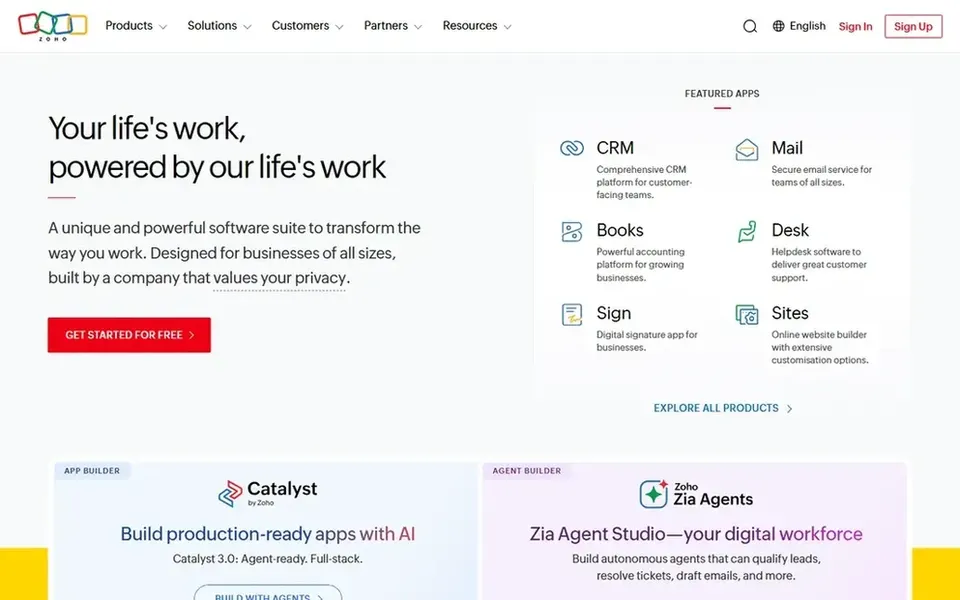
For wide app connectivity and AI insights, Zoho Analytics is a natural candidate. For nonprofits that depend on several software systems for donor management, accounting, and programs, Zoho Analytics gives you a way to unify data and create reports efficiently. Worth adding: choose Zoho Analytics when you have to pull together data from plenty of sources and want AI assistance in interpreting it.
Where it falls short: Interface can feel cluttered.
On top of that, Zoho Analytics is a data analytics and business intelligence system that links to many different apps, builds dashboards, and provides actionable insights immediately. Its AI-powered features help surface trends without deep technical skills. In practice, smaller nonprofits with straightforward data needs might find it more than necessary. Pricing for Zoho Analytics is not stated here, so ask the vendor for current figures. As for free access: Not stated.
Best for: End-to-end data integration and analytics
Choose Qlik Sense for end-to-end data integration and analytics. Qlik Sense, part of Qlik's data fabric and analytics options, supplies end-to-end data integration, data quality, and analytics. It is aimed at organizations that require to combine data from several systems and perform sophisticated analysis.
More specifically, nonprofits with complicated data environments, for example those managing large donor databases and program data, can benefit from its solid integration and governance features. Consider Qlik Sense if you have the resources to support it and need a capable, integrated data product. Qlik Sense shows no starting price here, so confirm the cost on the vendor site. Free options: Not stated.
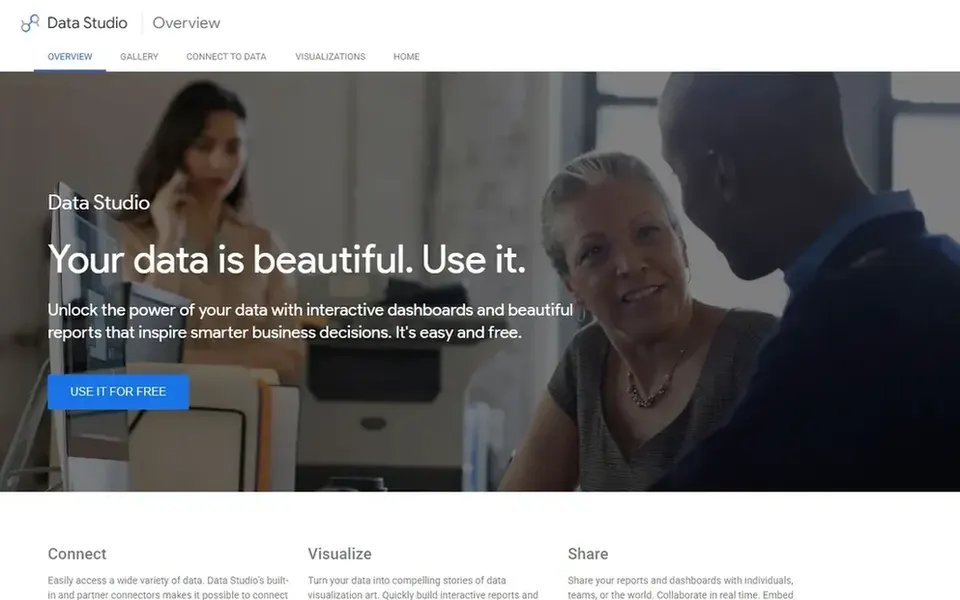
Looker Studio is designed for free dashboards with Google integration. Looker Studio has fewer advanced analytics and data transformation capabilities than enterprise BI systems, and performance can slow with very large datasets. It performs best for organizations whose data primarily lives in Google systems.
Drawbacks to consider: A good match for Google-centric data.
It excels at turning data from Google Ads, Google Analytics, Sheets, and other sources into beautiful, shareable visualizations. If you need complicated modeling or connections to numerous external databases, a more solid tool may be necessary. Nonprofits already using Google Workspace will find it especially accessible for tracking marketing, fundraising, and program metrics without added expense. Looker Studio does not show a starting price in this comparison, so check the vendor site for current pricing. Free plan details: Not stated.
Best for: Embedded analytics for custom applications
Sisense is aimed squarely at embedded analytics for custom applications. Sisense gives AI-powered embedded analytics that allow organizations to unlock insights and convert data into revenue, with adaptability across pro-code, low-code, and no-code approaches. For everyday use, setup and customization can need development resources.
In practice, pick Sisense when you have to integrate analytics into your own software and have the technical capacity to run it. Nonprofits that build custom portals or member-facing applications can embed analytics straight into their tools, supplying tailored insights to stakeholders without switching systems. Sisense does not show a starting price in this comparison, so check the vendor site for current pricing. Free options: Free trial.
Drawbacks to consider: Focus on embedding may not suit all.
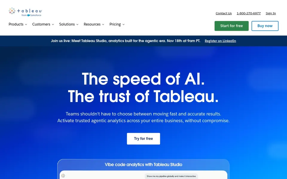
Tableau makes the most sense for visual analytics and data exploration. Consider Tableau when visual storytelling and solid data connectivity are priorities and you can invest in training. Tableau's depth can be overwhelming for small teams without analytics experience, and setup may need more time than more straightforward tools.
Drawbacks to consider: May need training for advanced features.
As for the details, Tableau is a business intelligence and analytics product that helps users see and understand their data. It lets connecting to almost any database, then dragging and dropping to build visualizations and share them with a click. This makes it a good fit for nonprofits that require to explore data deeply and communicate insights through compelling visuals, notably those with dedicated data staff or volunteers. Tableau cost at the entry level: $15 per user per month. Tableau offers a free plan.
Ask Domo, Zoho Analytics, Qlik Sense and others for a written quote, since no starting price is shown.
Look at the free plan from Tableau closely: its caps decide whether it is usable for real work.
Use real work to test the free trial from Domo and Sisense, rather than a demo project.
Before choosing Domo, weigh its main limit: can be overwhelming for small teams.
A short pilot of Sisense with your real workflow tells you more than a feature table.
Get the contract term, renewal terms and any onboarding fees from Tableau in writing.
How we picked
The comparison looks at four things: starting price, free access, how well the feature set matches BI software for nonprofits, and the main limit of each tool. Where a vendor does not publish a price, the entry says quote. Where a price depends on seats or billing term, the entry says so. The ranking is editorial: typical fit first, then clear pricing, then free access. If your needs are unusual, read the profiles rather than relying on position.
Every price and plan detail on this page comes from the vendors’ own websites. We did not run hands-on tests unless the text says so, and we do not publish star ratings or review scores. See how we score and our disclosure.
Keep your shortlist in one place
Paste prices, trial dates and notes from this guide into Ainotely, our AI note app. It files them into a topic and pulls out tasks like “cancel trial by Friday”. Free 7-day trial, no card needed.
Is Domo the right pick for everyone comparing BI software for nonprofits?
No single tool suits every team. Domo comes first because it fits governed data for AI and exploration, while Zoho Analytics suits broad app connectivity and AI insights and Qlik Sense suits end-to-end data integration and analytics. Match the tool to your own size, budget and workflow before deciding.
Which options for BI software for nonprofits have a free plan?
Tableau is the only tool in this list with a free plan. Free plans usually cap users, projects or features, so check the limits on the vendor page. Several others offer a trial instead. Pricing, free plan details and limits for all 6 tools in this BI software for nonprofits roundup sit on the individual cards above.
How do I choose between Tableau and Looker Studio?
Tableau gives you deeper analytics and links to almost any database, making it a good match for complicated data needs. Looker Studio is more straightforward and free, well suited to Google-centric data and entry-level reporting.
How are the tools for BI software for nonprofits ordered?
Domo sits first and Tableau last because the order follows typical fit for BI software for nonprofits, then price clarity and free access. It is a judgement call, so read each profile for fit and limits.
Do these tools publish their prices?
Not all of them. Domo, Zoho Analytics, Qlik Sense and others publish no starting price, so expect a quote request for those. The rest, Tableau included, show a starting price, though seats and billing terms still change the final cost.