This list puts Qlik Sense first for Analytics combined with data integration. Listed starting prices: Tableau from $15 per user a month. If your case is different, Oracle Analytics Cloud suits self-service discovery plus enterprise reporting and IBM Cognos Analytics suits dashboards, reports and AI-driven insights. The other 3 tools in the list cover narrower or pricier cases.
Ainotely compared 6 tools for dashboard software for supply chain KPIs. The goal is a practical shortlist: published prices, free plan facts, best-fit use cases and honest limits for every entry.
Key takeaways
Qlik Sense takes the first slot, best suited to Analytics combined with data integration.
Tableau has the lowest monthly starting price in this list: $15 per user per month.
Only Tableau offers a free plan among these 6 tools.
Check the limits for Qlik Sense before you commit: breadth can mean a steeper ramp-up time.
For connecting and moving data end to end, Domo is worth a look.
Best for: Analytics combined with data integration
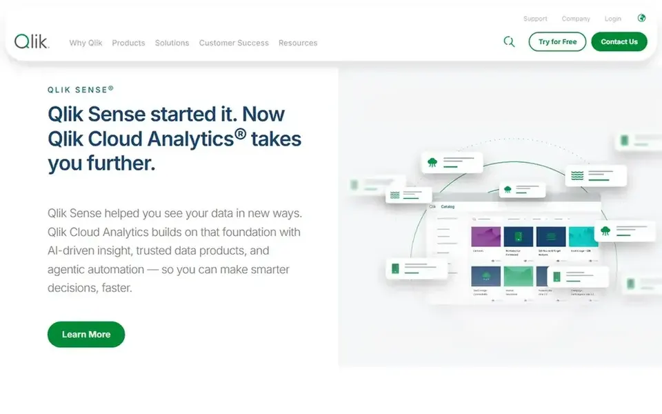
Choose Qlik Sense for Analytics combined with data integration. Qlik Sense sits within Qlik's broader platform, which now comes with Talend and spans data integration, data quality and analytics. Since the system handles numerous capabilities, getting started can involve more moving parts and a steeper learning curve than a focused visualization tool.
Drawbacks to consider: Breadth can mean a steeper ramp-up time.
If you only need fast charts from a single clean source, a more straightforward choice may be enough. In practice, teams dealing with messy data from suppliers, carriers and ERP systems may value having integration and quality capabilities in the same vendor relationship as the dashboards. In practice, pick Qlik Sense when data preparation and analytics should live together. Check the vendor site for Qlik Sense pricing; none is listed in this comparison. Free access: Not stated.
Best for: Self-service discovery plus enterprise reporting
Pick Oracle Analytics Cloud if this describes you: self-service discovery plus enterprise reporting. Teams already using Oracle data systems can keep analytics close to their source systems whereas giving business users room to explore.
The main drawbacks: Feature depth can slow onboarding.
On top of that, organizations wanting a light visualization layer may prefer Tableau. Oracle Analytics Cloud shows no starting price here, so confirm the cost on the vendor site. Free access: Not stated.
Best for: Dashboards, reports and AI-driven insights
IBM Cognos Analytics was built for dashboards, reports and AI-driven insights. IBM Cognos Analytics helps users explore data, build reports and produce dashboards with AI-driven insights to understand trends and make informed decisions.
Downsides: AI features need well-prepared data.
Consider IBM Cognos Analytics when reporting discipline and dashboarding should live together in an enterprise analytics environment. The interface can feel dense to newcomers, and AI-driven insights rely on well-prepared data. No starting price is listed for IBM Cognos Analytics here; confirm pricing on the vendor site. As for free access: Not stated.
Best for: Governed metrics with embedded analytics
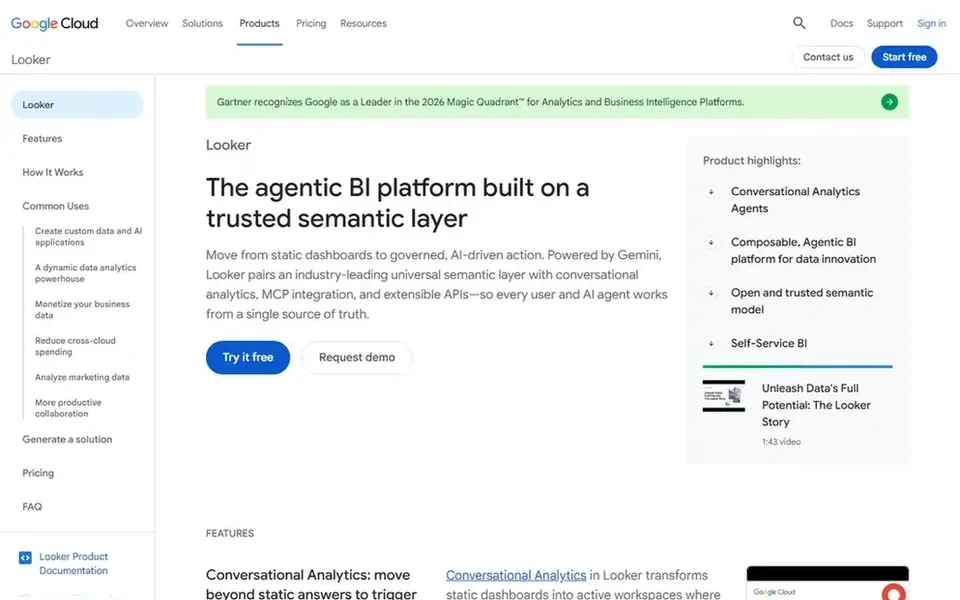
Looker was built for governed metrics with embedded analytics. Looker is Google Cloud's business intelligence and embedded analytics product. Its centerpiece is a trusted semantic layer that brings together metric definitions, supported by Gemini agents.
Also, the semantic layer is feature-rich but demands upfront modeling work, and the system is closely tied to Google Cloud. Teams without that ecosystem, or those wanting purely ad hoc exploration, may prefer Tableau. For supply chain KPIs, that means a single agreed definition of measures like fill rate or days of inventory can be modeled once and reused across dashboards and embedded applications. Looker does not show a starting price in this comparison, so check the vendor site for current pricing. Trial and free access: Not stated.
Best for: Adaptable visual dashboards from plenty of sources
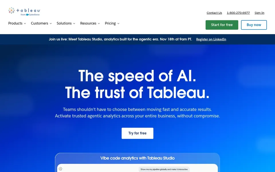
Tableau makes the most sense for adaptable visual dashboards from numerous sources. For supply chain KPIs for example on-time delivery, inventory turns and order cycle time, this adaptability lets analysts shape views around operational questions instead of fixed templates.
The main drawbacks: Governance needs deliberate planning.
If your priority is a centrally governed semantic layer over self-service exploration, Looker may be a better match. Starting cost for Tableau: $15 per user per month. Tableau includes a free tier.
Domo is a good fit for connecting and moving data end to end. Domo describes itself around governed data for AI agents, with products spanning the data journey. In practice, users link and move data from any source, prepare and expand access for exploration, and accelerate business-critical insights.
For everyday use, for supply chain teams, that end-to-end framing can ease pulling together data from suppliers, warehouses and transportation systems before building KPI dashboards for operations leaders. Consider Domo when data movement and preparation are part of the dashboard problem. Domo shows no starting price here, so confirm the cost on the vendor site. Free options: Free trial.
Limits to weigh: Wide system scope can overwhelm new users.
Ask Qlik Sense, Oracle Analytics Cloud, IBM Cognos Analytics and others for a written quote, since no starting price is shown.
Test the free plan from Tableau against your real workload before relying on it.
Run a trial of Domo with real work before paying for a year; your own workflow is the best test.
Before choosing Qlik Sense, weigh its main limit: breadth can mean a steeper ramp-up time.
Ask Oracle Analytics Cloud about contract length, onboarding fees and user minimums before you sign.
Test how quickly Qlik Sense answers a pre-sales question; it hints at how support will feel later.
How we picked
Selection started from tools commonly considered for dashboard software for supply chain KPIs, then narrowed to 6 that have clear pricing information or a clear quote process. Where a vendor does not publish a price, the entry says quote. Where a price depends on seats or billing term, the entry says so. Order on the page follows fit for the typical buyer first, then price transparency and free access. Your own requirements should decide the final pick.
Every price and plan detail on this page comes from the vendors’ own websites. We did not run hands-on tests unless the text says so, and we do not publish star ratings or review scores. See how we score and our disclosure.
Keep your shortlist in one place
Paste prices, trial dates and notes from this guide into Ainotely, our AI note app. It files them into a topic and pulls out tasks like “cancel trial by Friday”. Free 7-day trial, no card needed.
Which options for dashboard software for supply chain KPIs have a free plan?
Tableau is the only tool in this list with a free plan. Free plans usually cap users, projects or features, so check the limits on the vendor page. One other tool offers a trial instead. For the full picture, the cards above cover all 6 entries of this dashboard software for supply chain KPIs list, including price, free plan and limits.
How are the tools for dashboard software for supply chain KPIs ordered?
Qlik Sense sits first and Domo last because the order follows typical fit for dashboard software for supply chain KPIs, then price clarity and free access. It is a judgement call, so read each profile for fit and limits.
What is the cheapest option for dashboard software for supply chain KPIs in this list?
On published monthly entry prices, Tableau is the lowest here at $15 per user per month. Entry price is only part of the cost, because seats, add-ons and billing terms can change the total. Pricing, free plan details and limits for all 6 tools in this dashboard software for supply chain KPIs roundup sit on the individual cards above.
Can I try these tools before paying?
Often, yes. Tableau has a free plan and Domo offers a free trial. Use your own data and a real task during the test, and check what the free tier or trial limits before you rely on it. The 6 tool cards above repeat this per product for dashboard software for supply chain KPIs, with the listed price or "pricing on request".