Domo is the first pick on this list for governed data for AI-driven insights. Listed starting prices: Tableau from $15 per user per month. Look at Looker for governed metrics and embedded analytics, and at Tableau for interactive dashboards and visual exploration. All 6 tools are compared below on price, free plan and limits.
Ainotely put together this guide to Tableau visualizations for readers who want a clear shortlist without reading every vendor page. It compares 6 tools on starting price, free plans, who each one suits and where each one falls short.
Key takeaways
Domo takes the first slot, best suited to governed data for AI-driven insights.
Only Tableau offers a free plan among these 6 tools.
Sisense suits embedded analytics with adaptable coding.
Domo comes with a trade-off: may be overwhelming for small teams.
Tableau has the lowest monthly starting price in this list: $15 per user per month.
Domo is aimed squarely at governed data for AI-driven insights. It links and moves data from any source, prepares and expands data access for exploration, and accelerates business-critical insights.
Where it is weaker: May be overwhelming for small teams.
Domo's thorough feature set can be more than small teams need, and success depends on thoughtful governance. Domo does not show a starting price in this comparison, so check the vendor site for current pricing. Trial and free access: Free trial.
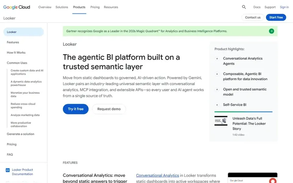
Looker works best for governed metrics and embedded analytics. Looker is Google Cloud's agentic business intelligence and embedded analytics system.
Looker's reliance on a semantic layer means upfront data modeling effort, and it is most natural for Google Cloud users. This comparison lists no price for Looker; ask the vendor. Free access: Not stated.
What to check first: Tied to Google Cloud ecosystem.
Best for: Interactive dashboards and visual exploration
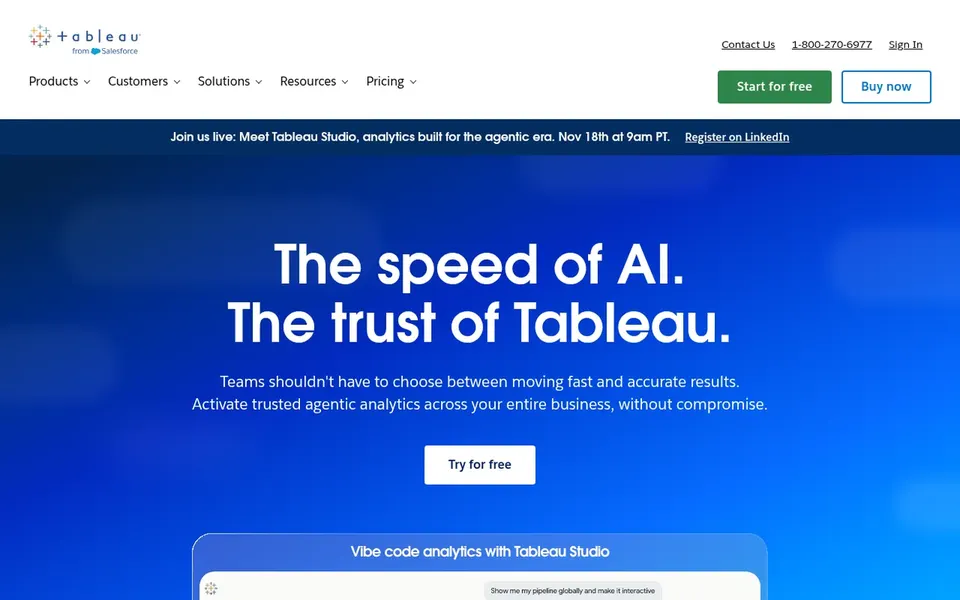
Tableau is aimed squarely at interactive dashboards and visual exploration. Tableau's depth can mean a ramp-up time for new users, and large-scale deployments may strain budgets. In daily use, if you need embedded analytics with a strong semantic layer, consider Looker.
For associative exploration, Qlik Sense may be a better fit. Tableau is a business intelligence and analytics system that helps users see and understand their data. It permits connecting to almost any database, then creating visualizations through drag-and-drop and sharing them with a click. On cost, Tableau starts like this: $15 per user per month. Tableau offers a free plan.
Trade-offs to know: Can require training for advanced features.
Best for: Associative data exploration and integration
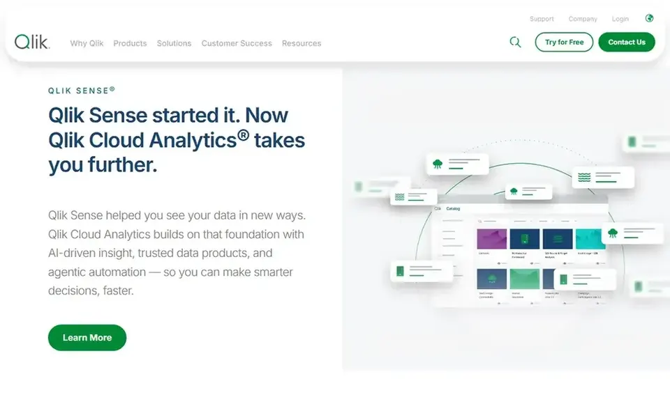
Qlik Sense was built for associative data exploration and integration. From a buyer's view, if you prioritize a straightforward drag-and-drop experience, Tableau might be simpler to adopt.
Where it is weaker: Complicated setup for beginners.
For embedded use cases, Sisense is worth considering. Pricing for Qlik Sense is not stated here, so ask the vendor for current figures. Free access: Not stated.
Best for: Embedded analytics with adaptable coding
Sisense makes the most sense for embedded analytics with adaptable coding. Sisense provides AI-powered embedded analytics to unlock insights and convert data into revenue, with pro-code, low-code, and no-code adaptability.
It is aimed at product teams and developers who want to embed analytics straight into applications and tailor the experience to their users. Beyond that, if you need a wide self-service visualization system, Tableau or Qlik Sense could be better suited. This comparison lists no price for Sisense; ask the vendor. Free access: Free trial.
Where it shines: Pro-code, low-code.
Points against: Customization can need developer time.
Ask Domo, Looker, TIBCO Spotfire and others for a written quote, since no starting price is shown.
Test the free plan from Tableau against your real workload before relying on it.
Take the trial from Domo and Sisense and push a live task through it before you pay.
Before choosing Domo, weigh its main limit: may be overwhelming for small teams.
Before rolling out Qlik Sense, verify the integrations your workflow depends on.
Read the plan comparison for Tableau carefully; key features often start on a higher tier.
How we picked
Pricing pages, product documentation and feature lists were the main sources, and every entry carries at least one honest drawback. Prices and plan limits come from vendor pages and can change, so confirm them on the vendor site before you buy. The sequence is a judgement call: typical use case first, then pricing transparency, then free access. Use the profiles to check fit. This applies to all 6 Tableau Visualizations options compared here.
Every price and plan detail on this page comes from the vendors’ own websites. We did not run hands-on tests unless the text says so, and we do not publish star ratings or review scores. See how we score and our disclosure.
Keep your shortlist in one place
Paste prices, trial dates and notes from this guide into Ainotely, our AI note app. It files them into a topic and pulls out tasks like “cancel trial by Friday”. Free 7-day trial, no card needed.
Is Domo the right pick for everyone comparing Tableau visualizations?
No single tool suits every team. Domo comes first because it fits governed data for AI-driven insights, while Looker suits governed metrics and embedded analytics and Tableau suits interactive dashboards and visual exploration. Match the tool to your own size, budget and workflow before deciding.
Which tool is a good match for embedded analytics?
The first pick on this list is Domo, because it suits governed data for AI-driven insights. Looker is better for governed metrics and embedded analytics, and Tableau for interactive dashboards and visual exploration. Check price and limits against your own needs before choosing.
How are the tools for Tableau visualizations ordered?
Domo sits first and Sisense last because the order follows typical fit for Tableau visualizations, then price clarity and free access. It is a judgement call, so read each profile for fit and limits.
What is the cheapest option for Tableau visualizations in this list?
On published monthly entry prices, Tableau is the lowest here at $15 per user per month. Entry price is only part of the cost, because seats, add-ons and billing terms can change the total. Pricing, free plan details and limits for all 6 tools in this Tableau Visualizations roundup sit on the individual cards above.
How does Qlik Sense differ from Tableau?
Qlik Sense emphasizes associative exploration and comes with data integration and quality through Talend, whereas Tableau concentrates on visual drag-and-drop analytics. Qlik may suit teams needing integrated data preparation.
Can I try these tools before paying?
Often, yes. Tableau has a free plan and Domo and Sisense offer a free trial. Use your own data and a real task during the test, and check what the free tier or trial limits before you rely on it. The 6 tool cards above repeat this per product for Tableau Visualizations, with the listed price or "pricing on request".